 The FTS Heat Maps
A “heat map”
is a way to use color to visualize data.
The FTS Heat Maps are a powerful way to visualize the performance of
stocks based on different criteria and over different time periods. They also let you
compare your portfolio to the market and understand why your portfolio is gaining or losing
relative to the market as a whole.
Contents
·
Understanding
returns
o
Beta
o
Portfolio by
value
o
Portfolio by
Sector
·
Fundamental
Analysis
o
Greenblatt’s “Magic Formula”
·
Sector and
Industry Analysis
o
Averages
You access the heat maps through the Heat Maps tab on the
Windows version of the FTS Real Time Client, and are currently available for the
US stock cases; they will be extended to other
countries and platforms.
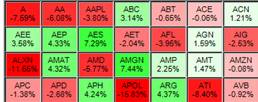
The base heat map is shown in the following picture. Notice the box on the left, where you select what you want to see and the time period (“1 Month Return” in this picture):
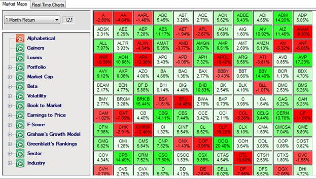
This picture shows the performance of all stocks in the case, over the past month, sorted alphabetically. The sorting options are on the left, as are the periods over which returns are depicted. You can look at return over one day, 1 month, 3 months, 6 months, and 1 year from the dropdown menu. The little “123” box next to the time period shows you numerical values.
Alphabetical sorting makes it easy to locate a company. The next two options let you sort by winner and losers, telling you at a glance which stocks have gained or lost the most over the period. For example, you can quickly see which stocks in the case have gained the most today.
If you click on a box displaying an individual ticker, the display will switch away from the heat map and show you quotes and information about the stock.
Note: this only happens when you click on a box
depicting a stock ticker. If you are
viewing deciles or averages, clicking on a box will show you numerical values
of the stocks whose returns are aggregated in the box.
Understanding Returns
The next part lets you study return patterns based on factors that are important in understanding stock returns. These factors include beta, volatility, market cap, and what is called “book to market” and also the ratio of earnings to price.
Market cap is the market value of the company, i.e. the shares outstanding multiplied by the stock price. By sorting on market cap, you can see how large companies have performed (or are performing today) relative to small caps, i.e. companies with a small market value. Market cap is a measure of firm size, and it has long been observed that small caps generate higher returns than large cap stocks (though not necessarily on a risk adjusted basis).
Book to Market The book value of a company is also known as the shareholders’ equity or stockholders’ equity, and you can find it on the balance sheet of a company’s filings. It measures the value of a company’s assets minus the value of its liabilities, and so is the net worth of the company, i.e. the total amount that would be given to shareholders if the firm was to be liquidated. The market value of the company is what investors are willing to pay for the company. If the book value is less than the market value, then investors are willing to pay a premium for the company, perhaps reflecting an expectation of earnings growth. Low book to market stocks are sometimes called growth stocks, while high book to market stocks are considered value stocks.
An influential study by Fama and French (Journal of Finance, 1992) shows that both market cap and book to market are important determinants of stock returns. Another important determinant is beta.
Beta measures the sensitivity of a stock to a market benchmark, such as the S&P 500 Index. The Capital Asset Pricing Model (CAPM) postulates that the expected return on a stock is given by
![]()
Here, rf is the risk free interest rate and rm is the return on the market portfolio, and usually, a proxy such as the S&P500 index is used to measure this return. The CAPM implies that a stock with beta greater than 1 should have a larger volatility than that of the market benchmark.
If you sort by beta, you can see whether high beta stocks are out-performing low beta stocks. If you put your mouse over a box, it will tell you the stock name as well as the beta of the stock. If you click the “123” box you will see the numerical values: the stock name, beta, and return over the period.
You can also view this by deciles. In decile analysis, we divide the data into ten parts: the top 10%, the next 10%, and so on. So Decile 1 in the picture below shows you the average performance of the 10% of stocks that have the highest beta within the set of stocks in the case. You can see that over the last 3 months, higher beta stocks have performed better than lower beta stocks:
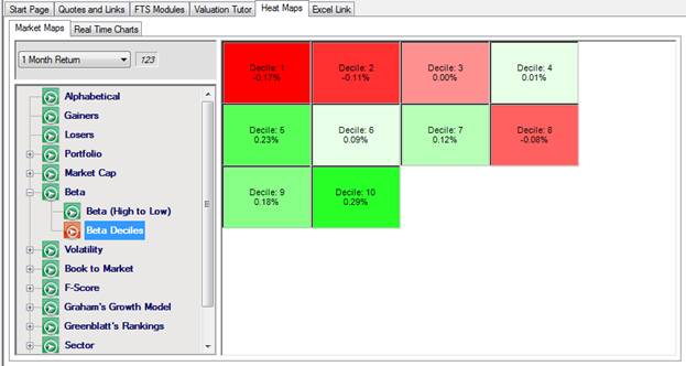
If you click on a decile, you will see the stocks in that decile. This serves as a screening device, for example, if you click on Decile 1, you would get a list of the 10% of stocks that have the highest beta.
Volatility is the standard deviation of a stock return. The volatility of a stock’s return is not completely captured by beta; the part that is captured by beta is sometimes called the “systematic risk” of the stock and the remainder is called the unsystematic risk or the idiosyncratic risk. You can see this from the regression equation typically used to estimate beta:
![]()
Then, the variance of the stock return is
![]()
The first part is the systematic part (i.e. due to the market) and the second part is the idiosyncratic part, i.e. due to stock-specific factors, uncorrelated with overall market movements.
Academic research has documented that idiosyncratic risk is an important determinant of stock returns. If the idiosyncratic risk is small, then looking at return by volatility should give you the same picture as that from looking at return by beta. By switching back and forth between the two, you can quickly discern whether high beta stocks are basically high volatility stocks, and whether the return pattern based on volatility is similar to that based on beta.
Note: by clicking on “123” you can get numerical values of volatilities and betas and export them into a spreadsheet if you want to conduct a detailed comparison.
Earnings to Price is ratio of earnings per share to the price of a stock. Note that this is the inverse of the “P/E” ratio, which is the ratio of price to earnings. The reason we choose E/P rather than P/E is that earnings can be zero, which a price is always positive, and so the E/P ratio is always well defined. A stock that has a low E/P ratio (so a high P/E ratio) are sometimes though to have higher growth potential, while those with a high E/P (so low P/E) are expected to have lower growth potential.
The heat maps described so far let you look at the market and look at performance along dimensions that are considered important determinants of stock returns. Next, we consider your portfolio. In this part, the numerical values provide detailed information beyond what is in the heat maps.
The first heat map shows you portfolio returns based on the value of the position, for example:
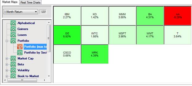
In this example, the most money has been invested in IBM, and there is a short position in MRK. By putting your mouse over a box, you can see the value of the position. This map shows you how your long positions are performing relative to your short positions if you are following a long-short strategy.
If you click “123” you get more detailed information:
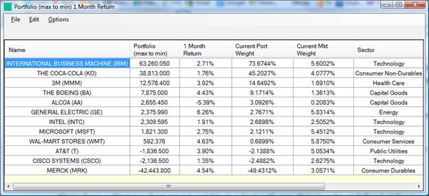
This provides more information than just the return: it tells you how your portfolio compares to the market. Let us explain that further.
In this write up, we will use the FTS 30 stock case to keep calculations simple.
· What is the current portfolio weight
o This is the current value of the stock position divided by the total amount invested in stocks. Note that it does not include cash or any other assets: this is simply an analysis of the dollar amount invested in stocks.
o Here, if you sum up the portfolio column, which shows you the value of the position in each stock, you will get 85,864.36. The value of the position in IBM is 63,260.05, so the “Current Port Weight” is 63,260.05/85,864.36 = 0.736744, shown above as 73.6744%
o Note on short positions:
§ From the “How Securities are Traded” and the Portfolio Diversification projects, you know that a short position requires you to put up a deposit in addition to the value of a short position. This leads to a different portfolio weight, which takes into account all of this. Here, we focus instead on the raw portfolio weight because it more natural. For instance, in this example, your short position in MRK has made money over the past month.
§ This does lead to a complication: what if you only have short positions? What if the value of the short and long positions is zero or negative? In these cases, we use the absolute value of each position to calculate the total, and calculate the weights relative to that.
o Note on return calculations
§ The returns are calculated assuming you bought the shares you hold now at the prices at the beginning of the period, in this example 1 month ago.
· What is the current market weight
o This is calculated as the value of the company (price time shares outstanding) divided by the total market cap of all the stocks (in the case). This is the usual way of calculating weights for a value weighted index.
So now you can do the comparison. If you invested “like the market,” you would have put 5.6002% of your money into IBM. Instead, you have put 73.6744% in IBM. “Investing like the market” is sometimes called “passive investing.” This is obviously a good strategy if you cannot beat the market!
The next heat map, sorting your portfolio by sector, provides even more information. It tells you where your portfolio is beating the market and where it is lagging. This is known as “attribution analysis.” The numerical values you get when you view Portfolio by Sector look like this (the prices are different from the previous numeric display, so the weights etc. are slightly different):
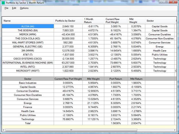
The top half has the same information as the previous display; the bottom half shows you how your portfolio differs from the market in terms of sectors. For example, this portfolio has invested about 45% in Consumer Non-Durables while the market weight of that sector is only about 4%. So the portfolio is over-weighted in this sector. It also shows you the portfolio return and the market return by sector.
Fundamentals
We use the term “fundamentals” to refer to items in the financial statements. Here, we have three ways to look at stocks. The first is called the F-Score, due to Piotroski, in a paper published in 2002. The F-score looks at 9 variables about a company, and for each variable, assigns a score of zero or one. The F-Score is simply the sum of the scores of the 9. The variables and the scoring system are shown in the following table.
|
Variable |
Score |
|
Return on Assets (ROA) |
1 if ROA is positive, 0 otherwise |
|
Change in ROA |
1 if Change in ROA is positive, 0 otherwise |
|
Cash Flow from Operations (CFO) |
1 if CFO is positive |
|
CFO - ROA |
1 if the difference is positive, 0 otherwise |
|
Change in Leverage Ratio |
1 if negative, 0 otherwise |
|
Change in liquidity |
1 if positive, 0 otherwise |
|
New Stock Issue |
1 if zero, 0 otherwise |
|
Change in Gross Margin |
1 if positive, 0 otherwise |
|
Change in Asset Turnover Ratio |
1 if positive, 0 otherwise |
The first F-score heat map shows you how stocks with high F-Scores are performing relative to those with low F-scores. You can also see compare the average return of stocks by F-Score.
Graham’s growth model comes from a formula due to Benjamin Graham for valuing a company. His formula is:
V = EPS * (8.5 + 2g)
V is the value of the company, EPS is earnings per share, and g is the expected growth rate of earnings. Given the current stock price, say S, you can calculate a “margin of safety” as follows:
MS = (V-S)/S
If a stock is overprices relative to Graham’s formula, the margin of safety is negative, and if a stock is underpriced, the margin of safety is positive.
The heat map shows you the performance of companies sorted by their margin of safety.
Greenblatt’s Magic Formula also ranks stocks based on fundamentals. Define
ROC = EBIT/Capital
EY = EBIT/Value
Here, ROC stands for Return on Capital, EBIT is Earnings Before Taxes and Interest, EY is Earnings Yield, Capital refers to working capital, and Value is the enterprise value.
The formula ranks stocks by both criteria, then sums up the ranks. Suppose the best ROC stock is ranked 1, but on EY, it is ranked 10. Then its summed rank is 11. Note here that a low number for the rank is good. “Magic Formula” investing buys stocks based on these ranks.
The last set of heat maps show you returns when stocks are sorted by sector or by industry, and also the average performance of each sector or industry. The numerical values also show you your portfolio’s allocation to the sector or industry. The sector maps help with sector rotation strategies.